READ TIME - 5 minutes ⏳
An old man is sitting on his boat.
The boat itself is still resting on the beach, dry sand under the hull, no waves in sight, no sign that it has ever touched the water.
Painted on the side, in large letters, is the boat’s name: “Waterproof”.
The typography choice makes it even better: Comic Sans.

Belgian humour really is something!
But beyond the smile it triggers, that boat is doing something surprisingly familiar. It is making a promise before it has been tested. A declaration made in advance, without evidence, relying entirely on the confidence of the label itself.
That, in essence, is exactly what most chart titles do.
Titles are promises, not labels
A title is not a decorative element. It is not metadata. It is not a technical requirement to satisfy a layout constraint.
A title is the first contract you sign with your reader.
It quietly tells them what they are about to look at, why it matters enough to deserve their attention, and how they should interpret what follows. Before a single data point is read, the title has already framed the experience.
And yet, in dashboards, reports, slides, and visuals of all kinds, titles are often treated as an afterthought. Something descriptive. Something neutral. Something you’ll “fix later” if there’s time.
Just like calling a boat “Waterproof” before it ever touches the water.
The quiet damage of bad titles

The most dangerous thing about bad titles is that they rarely look wrong.
They look harmless:
- “Total orders.”
- “Revenue by date.”
- “Active users.”
There is nothing incorrect about these titles. Nothing offensive. Nothing obviously broken. And that’s precisely the problem.
They merely repeat information that is already visible elsewhere: through axes, legends, filters, or data labels. As a result, the title contributes nothing to interpretation. It adds no direction, no emphasis, no meaning.
Which leaves the user facing the most dangerous question in analytics:
“Okay… but what am I supposed to see here?”
Before we talk wording, let’s talk intent
Good titles are not about style.
They are about intent.
Before choosing a single word, it’s worth being explicit about the role the title is meant to play. Is it here to confirm a known trend? To highlight an anomaly? To challenge an assumption? To answer a specific business question? Or to guide a decision?
If that intent is not clear to you, no amount of clever wording will save the title later.
If your title only works because you were in the meeting, it’s doing as much work as the word “Waterproof” on that boat.
A few principles that actually matter
Once intent is clear, wording becomes much easier. Over time, a few principles tend to surface again and again.
First, write for humans, not parsers.

Avoid symbols, underscores, cryptic abbreviations, or internal jargon. Not because machines can’t read them, but because humans shouldn’t have to decode what they are looking at.
The characters you save in space often cost your users time and mental energy.
Second, pick a voice (and commit to it).
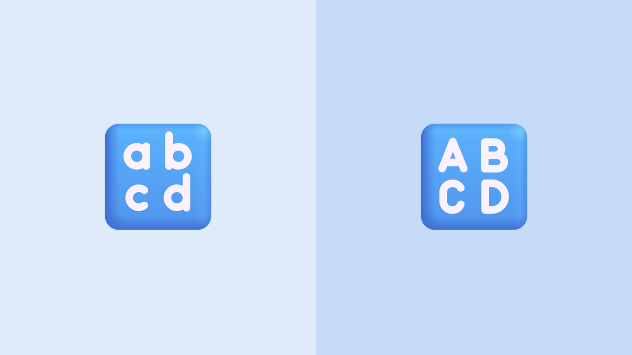
Titles speak, whether you want them to or not.
- All lowercase tends to feel softer and more conversational.
- ALL CAPS feels declarative and authoritative.
- Title Case reads as editorial and explanatory.
None of these choices are inherently better than the others, but inconsistency is always worse than the wrong choice. And as a simple reminder:
nobody actually thinks in camelCase.
Third, decide how much work the title should do.
Short titles are scan-friendly, work well in dashboards and overview pages, and help users move quickly. Longer titles, on the other hand, can carry context, introduce narrative, and reduce the need for explanation elsewhere.
Both approaches are valid. What isn’t valid is a title that does neither.
Finally, accessibility is not optional.

If a title requires prior knowledge to understand, it’s not a title: it’s a gate. Avoid unexplained acronyms, internal vocabulary, or clever shortcuts that only make sense if you were in the meeting where the dashboard was designed.
And once you choose a format, stay consistent. If “YoY” is capitalized in one place, it should be capitalized everywhere. Consistency is how systems earn trust.
Titles should elevate the chart, not describe it

This is where things usually click.
If removing the title does not change how the chart is understood, the title is useless.
Instead of repeating structure - like “Total orders by date” - a title can introduce meaning. It can ask a question, state a conclusion, or frame a comparison.
- “What is our monthly order record?”
- “March was our strongest month (+1,240 orders vs last year).”
- “Order volume peaked ahead of the summer campaign.”
The chart didn’t change.
The meaning did.
That is the actual job of a title.
Please, don’t remove them

Titles are often the first thing cut when inspiration runs out, deadlines get tight, or the Jira ticket just needs to be closed.
But removing titles doesn’t make visuals cleaner. It makes them silent.
Every visualization deserves a small layer of guidance. A sentence that says, implicitly or explicitly: “Here’s how to read me.”
Think of an ID card

Remove the metadata from an ID card (no name, no date, no context) and no matter HOW beautiful you are, the visual alone is never enough to explain WHO you are. You can look at it, but you can’t understand it.
Visuals work the same way.
Titles are not decoration. They are identity.
The boat named “Waterproof” will eventually touch the water. Then we’ll see if the promise holds.
Your titles don’t get that luxury (!!!)
They are tested the moment someone looks at your work: "before it starts".
Thoughts on this release?
I’d love to hear what you think. Your feedback helps shape what comes next!
'Til next week, tare care, and thank you for reading.
Julien