READ TIME - 6 minutes ⏳
The first failure in a reporting system often happens before a single visual exists.
It begins the moment a theme is assumed to have meaning it doesn’t actually contain.
When a palette pretends to be a system
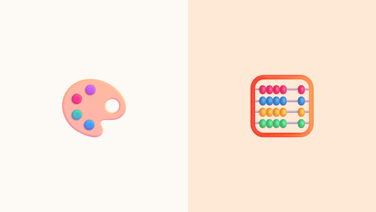
In many teams, the creation of a Power BI theme begins with a palette.
Someone collects a row of brand colors (usually the same ones used for marketing sites and slide decks) and places them into a JSON file. The file looks structured. The values look deliberate. The process feels complete.
But a palette is not a system.
A list of hex codes does not carry meaning.
It is only a group of values until someone decides what they represent.
Most themes begin their life as a disconnected collection of corporate colors, not a language with purpose. The absence of meaning is rarely noticed at the start, because the beginning of a system always looks tidy. It’s only later, when the work becomes real, that the cracks become visible.
And by that point, teams forget that the theme (and not the report!) made the first move.
The meaning that was never defined
A theme without semantics is not neutral.
It is simply ambiguous.
Colors do not behave as interchangeable units. They carry assumptions about priority, emotion, and cognitive weight; even when no one intends them to.
When a system offers values without roles, every author must embed their own interpretation into each visual. That interpretation becomes the real system, distributed across dozens of people, each making quiet decisions that were supposed to be shared.
Analytical surfaces amplify this problem.

A line chart using a saturated color for context will overpower a KPI that needs that saturation to signal importance. A button that uses the brand’s primary blue to indicate a selected record will collide with a card that uses the same blue to signify “positive.” A warning color that works in a UI becomes overwhelming when applied to a dense matrix.
It’s not that anyone made a mistake.
It’s that the system provided no guidance about what the colors were for.
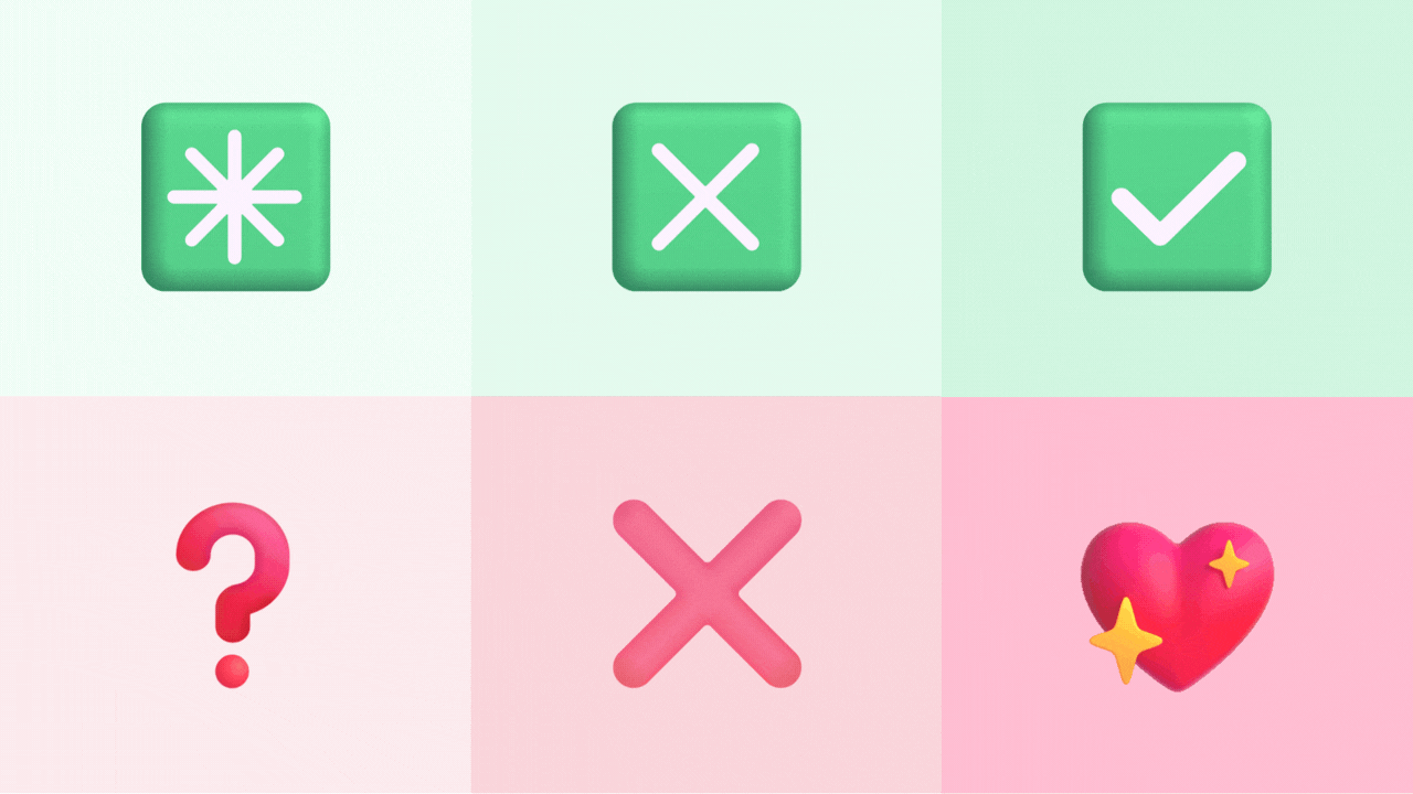
Design systems avoid this. They assign purpose before anyone uses the values: success, warning, highlight, neutral, subtle, emphasis. These roles act as a semantic backbone. The visual layer rests on top of them. Without this layer, consistency becomes a matter of taste rather than intent.
A theme built without semantics will always drift.
The drift is slow, polite, and unnoticed... until it becomes expensive.
Interpretation drift happens quietly
By the time the consequences appear, they rarely resemble a theming problem.
A stakeholder notices that two dashboards tell the same story but feel different.
A review meeting gets stuck debating why a chart looks “unbalanced” even though it matches every documented standard.
A report is approved one week and rejected the next, not because the data changed, but because the interpretation of color changed with the audience.
None of this looks like a missing semantic layer.
It looks like stylistic disagreement, personal taste, or inconsistency in execution.
But the drift began much earlier: the moment the palette was treated as a decision, not a placeholder. Each author filled the semantic vacuum in their own way. Over months, the vacuum produced divergent systems that still appear visually related, which makes the misalignment harder to diagnose.
The result is a theme that communicates nothing reliably.
It supports coherence only under perfect conditions.
The moment pressure increases (new metrics, new categories, new audiences) the system collapses into color noise.
No one blames the theme, because the theme was assumed to be neutral.
The patterns that give the System away

The absence of semantics does not announce itself.
It leaves a trail of small, recurring signals: each easy to ignore, but hard to overlook as a whole.
-
Interchangeable colors
Visuals reuse color hues for unrelated concepts, because nothing in the system assigns purpose.
Colors appear abundant but directionless. -
Volatile emphasis
Some figures appear overly intense while others fade unintentionally.
Not due to analytical importance, but because each author decided what “primary” means. -
Aesthetic debates instead of interpretive clarity
Review meetings fixate on whether something “looks right.”
Intent becomes secondary to personal preference, because the system provides no shared criteria. -
Escalating accents
Requests to “make this POP OUT” appear often.
Authors increase saturation because the theme offers no calibrated spectrum of emphasis. -
Familiar components that feel unrelated
Two visuals built from the same palette look strangely disconnected.
Not because the palette changed, but because the meaning behind its values never existed. -
Meaning collapses when data deviates
Reports hold together only when values behave predictably.
When categories shift, or thresholds invert, or outliers appear, the visual logic fails by revealing that nothing semantic was encoded into the system.
These signals are not anomalies.
They are symptoms of a foundation that was never established.
A theme without language has no foundation
A Power BI theme is often mistaken for a cosmetic asset: a decorative wrapper placed on top of analytical work. But in practice, it is a system of decisions about hierarchy, emphasis, emotion, and clarity. When those decisions are absent, the work that follows becomes interpretive rather than communicative.
A theme without semantics can only describe how something looks.
It cannot convey what the design is supposed to mean.
If this feels familiar, the problem did not begin in the report you are looking at today. It began much earlier, long before anything was built.