READ TIME - 4 minutes ⏳

A couple of years ago, ✨ someone in my building ✨ got tired of late-night-4AM parties coming from an upstairs neighbor.
Not angry enough to escalate.
Not certain enough to complain formally.
Just frustrated (and unsure whether they were the only one hearing it).
That uncertainty is important. It’s the same place many analytics users are in every day: they feel something is off, but they don’t quite know how to express it.
The problem behind the story
When people aren’t confident in what they’re seeing, they fall back on what feels safe.
In analytics, that safety usually looks like tables, matrices, and familiar charts. Not because they’re always the best choice, but because they’re easy to ask for and hard to argue against.
That comfort comes at a cost.
When users don’t feel equipped to explore data in other ways, maturity stalls. Reports multiply, conversations repeat, and teams spend their time rebuilding instead of improving.
This is the friction most analytics teams underestimate.

The obvious solution that would have failed
In the building, there would be an obvious way to handle the noise issue.
- Write a note to complain.
- Hang it in the hallway.
- Hope the right person reads it and the problem goes away.
It would have been technically correct...
...and largely ignored!
Writing a note was the sensible thing to do. It was simple, visible, and avoided turning the situation into a confrontation. But it also limited what people could add. One message, one voice, and no real way for others to contribute their own experience on top of it.
What actually happened
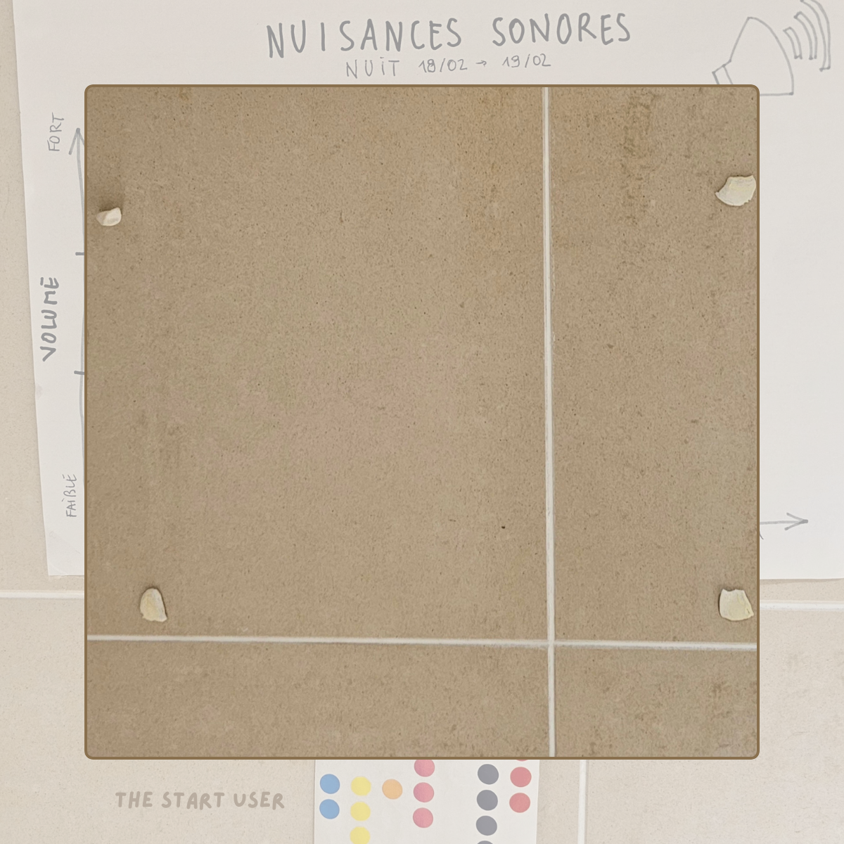
Instead, a simple poster appeared in the hallway:
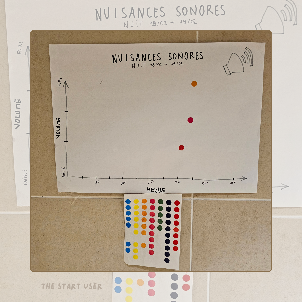
- A hand-drawn chart.
- Time along the bottom.
- Volume level on the side.
- Colored dots underneath.
- Enough context (titles, dates, icon).
No explanation of axes. No definition of chart type. No instructions beyond “add a dot where it felt right.”
People didn’t analyze it. They interacted with it.
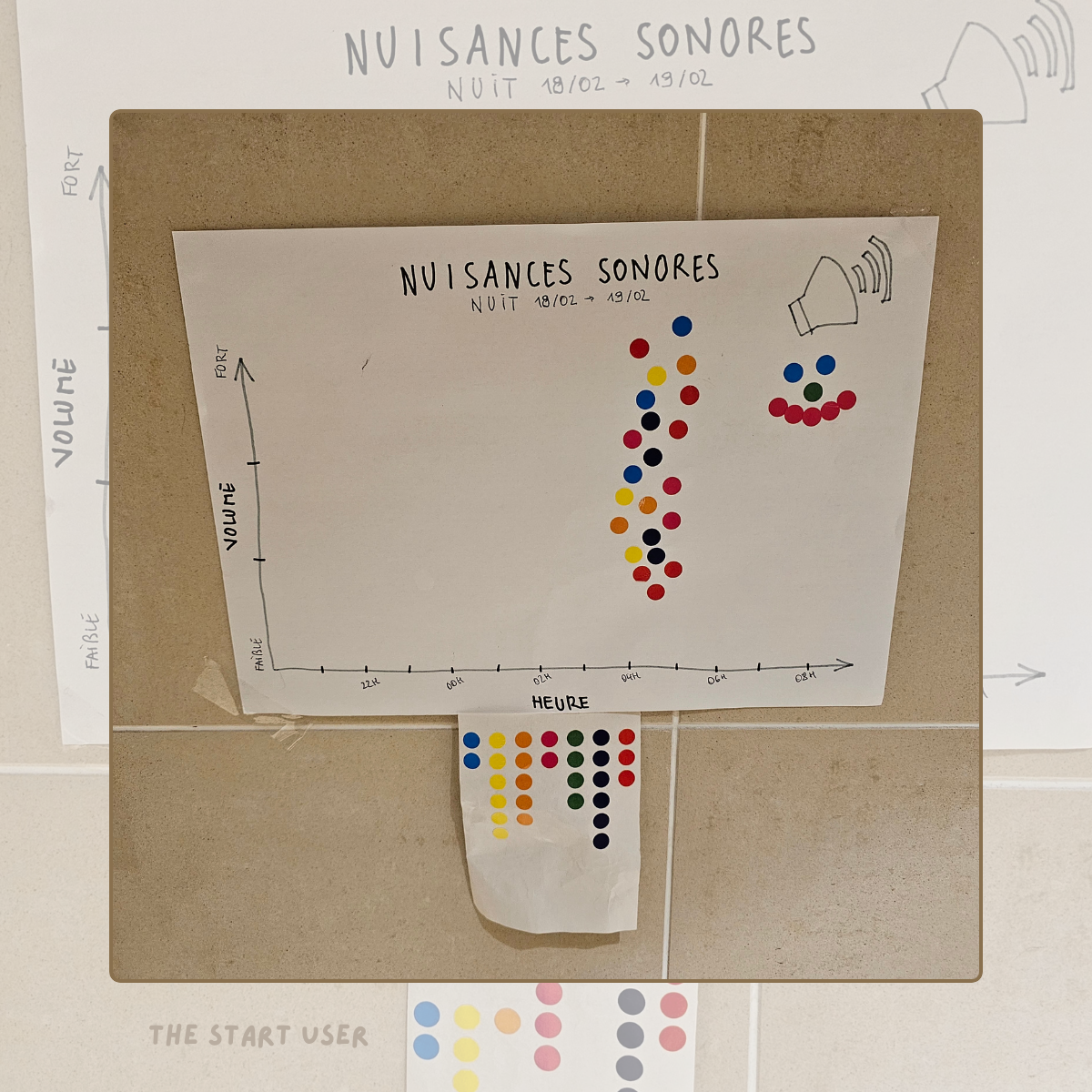
By the end of the day, almost every neighbor had contributed. Shortly after, the poster came down (and the noise stopped for good).
Why this worked
This worked because the visualization removed friction.
No one was asked to understand a chart.
They were invited to participate in one.
The act of placing a dot did three things at once:
-
it made the problem visible
-
it normalized individual experience
-
it created shared understanding without debate
That’s the transformation Analytics Teams often miss.
What this means for Analytics Teams
Most analytics work treats visualization as the final step.
Data → model → report → chart → explanation.
But this story points to a different approach: using visualization as a learning surface, not just a delivery mechanism.
This is where workshops, design reviews, and data visualization libraries become powerful. Not as teaching tools, but as exposure tools.
These tools help your users reach new heights and elevate their design maturity!
So next time you're sketching with users, do not say:
“We won't use this chart. See here, this one is better.”
You could (should?) instead create spaces where users can:
-
see multiple representations of the same data
-
react before they analyze
-
compare what feels clearer or more confusing
Over time, their requests change. Their questions sharpen. Their comfort zone expands. That’s how maturity grows: quietly, without forcing it.
Try this in your next workshop
Pick one real dataset your users already know.
Don’t explain them upfront, and show them three different visualizations of the same data. For example, you can pick:
-
a table
-
a simple bar or dot chart
-
a more opinionated view that highlights contrast or change
Just ask them:
-
"What do you notice first?"
-
"Which view makes the decision clearer?"
-
"Which one would you use, and why?"
And let the discussion do the teaching.
This excercise will has several benefits: it involves your end-users, help them grow their dataviz maturity and - last but not least - it also allows you to connect with them through a "fun" practice.
Remember
You don’t need to explain data visualization for people to understand patterns. You just need to give them a way in.

If this resonates, you’ll like what’s coming next.
This newsletter is about helping analytics teams grow design maturity through exposure, process, and reusable systems.
Not by teaching charts, but by changing how people experience data(viz).
Share your thoughts and feedback by clicking the button below:
See you next week!
Julien