READ TIME - 7 minutes⏳
An orchestra doesn’t fall apart because the musicians are bad.
It falls apart because there’s no conductor.
Everyone on stage may be deeply talented. They’ve trained for years, they know their craft. But without someone setting the tempo, unifying the vision, and guiding the interpretation of the score - things begin to drift. Timing is off. Harmonies clash. Everyone’s doing their best, but the result is still hard to listen to.
The hidden chaos behind the curtain
This is exactly what happens inside many organizations without a real design system.
At first glance, the work might look okay. The brand seems present. The colors are close. But underneath the surface, you start to feel the dissonance. Designers interpret the brand in slightly different ways, depending on their project, mood, or memory. Developers rebuild components that already exist (or almost exist) because it's faster than navigating the latest shared file. Layouts evolve not based on shared principles, but on personal preference, project deadlines, or whoever shouted loudest in the last meeting.
And the product? It technically works. But it doesn’t feel right.
Not broken, just incoherent.
The illusion of having a system
Here’s the tragedy: most teams think they have a design system.
There might be a Figma file called "DS," a PowerPoint somewhere with some do’s and don’ts, or maybe even a page in Confluence. But that’s not a system. That’s a static folder of assets. A disconnected set of slides. A graveyard of guidelines.
Nothing talks to anything else.
Change the name of a component in your slide deck and… nothing else updates. Not your Power BI report, not the coded component, not even the next designer’s file. Everything has to be manually updated. A change in one place becomes a dozen micro-decisions scattered across your team. The “system” is held together by Slack messages and wishful thinking.
The result? A product experience that feels like a jam session where everyone’s playing a different tune.
And while users rarely call out inconsistency directly, they feel it.
It shows up as hesitation. Doubt. Discomfort.
“Why does this screen feel different?”
“Am I still in the same product?”
“Can I trust what I’m seeing?”
That quiet uncertainty undermines trust, creates friction, and weakens the very brand you’ve worked so hard to build.
Internally, the pain is louder. Teams argue over design decisions that should’ve been solved once. “Reusable” becomes a fantasy. Standards exist, but no one knows where, or whether they’re still valid. Every new release feels heavier than the last: riskier and slower.
Your org isn’t inefficient because your people are bad at their jobs.
It’s inefficient because there’s no shared rhythm.
A one-person band can’t scale
There’s a myth that systems stifle creativity. That too much structure kills innovation. But here’s the truth:
A good system doesn’t restrain creativity, it protects it.
Right now, many teams are doing everything, everywhere, all at once. You’re singing the melody, beatboxing the rhythm, and manually mixing the sound every single time.
You’re a one-person band, and your voice is running out of breath.
Now imagine joining an orchestra.
You’re no longer carrying everything alone. You’re supported. You play your part (and others play theirs). Together, you create something richer, deeper, more powerful than you ever could solo.
This is what a real design system makes possible.
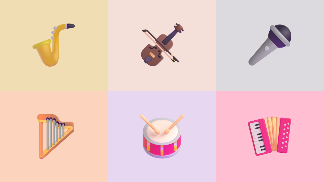
From improvisation to harmony
Each component becomes an instrument: buttons, charts, cards - all playing in harmony:
- The style guide becomes your conductor, setting the pace and ensuring alignment.
- Design principles are the music theory, defining what works together and what doesn’t.
- Company culture? That’s your genre. It shapes the tone of the whole performance.
And your design tokens, layout grids, accessibility rules?
They’re the sheet music. They ensure everyone plays the same song, no matter the team, the platform, or the user.
Importantly, great musicians still improvise. They go off-script. But only because they know the basics. They’re grounded in shared structure, and the shared score ensures timing, harmony, and intent stay aligned.
That’s what a real system enables: informed decisions, applied consciously, without breaking coherence.
And when this happens, everything changes: designers stop second-guessing. Developers reuse more than they rebuild. Product managers don’t have to micromanage layout tweaks.
The foundation is set, so teams can focus on what matters: deeper analysis or more discovery sessions to understand users' pain points.
Well, and your users? They don’t notice the system. They just feel the product. They feel clarity. Cohesion. Confidence.
They feel like they’re in the right place.
Accessibility: designing for more ears in the room
In a well-run orchestra, the goal isn’t just to play well for the front row.
The music needs to be heard clearly, from every seat in the room.
That’s what accessibility looks like when it’s built into a design system from the start.
When guidelines are explicit and proven:
- High contrast isn’t a special case.
- Clear hierarchy isn’t an enhancement.
- Predictable interactions aren’t “nice to have.”
They are what make an interface intuitive, not just for users with declared accessibility needs, but for everyone.
Accessibility, in this sense, isn’t about future-proofing. It’s about designing a clearer experience from day one. A good system doesn’t ask teams to “do accessibility later.”
It makes the right thing the easiest thing to build.
I've heard this song before
I’ve helped teams of all sizes (from two-person Power BI teams to complex, multi-brand enterprises with 250+ developers and multiple languages) build systems that actually scale.
And across the board, the story usually starts the same:
“We don’t know where to begin.”
Or worse:
“We thought we already had one.”
Whether it’s building from scratch or turning your scattered assets into a living, breathing system, I help organizations bring harmony to their design and data experiences.
Let’s tune your system
If your product feels “off",
If you’re tired of solving the same visual problems over and over,
If your teams are talented but not aligned.
It’s time to rethink the way you work.
📩 Just click below to start a conversation.
Let’s build a system that doesn’t just scale, but sings.
Clear. Cohesive. On-brand.
Like music to your user’s ears.
Cheers,
Julien