Accidental dataviz solutions
READ TIME - 5 minutes ⏳
Email formatting looks broken? click here to view in browser.
Most successful dataviz projects share an uncomfortable origin story: nobody planned for them to work. A report gets built, it lands with the right person at the right moment, they find it useful, and the team takes that as validation. But if you trace back what actually happened, the success had less to do with the quality of the design and more to do with luck, timing, and the fact that someone's instinct about what users needed happened to be correct.
That is not a process. That is a fortunate accident, and it does not repeat reliably.
The teams that build solutions that consistently get used are not necessarily more talented than the ones whose reports sit unopened. They have simply figured out how to make the outcome less accidental, and almost all of them arrived at the same answer:
involve the user before you involve the tool.
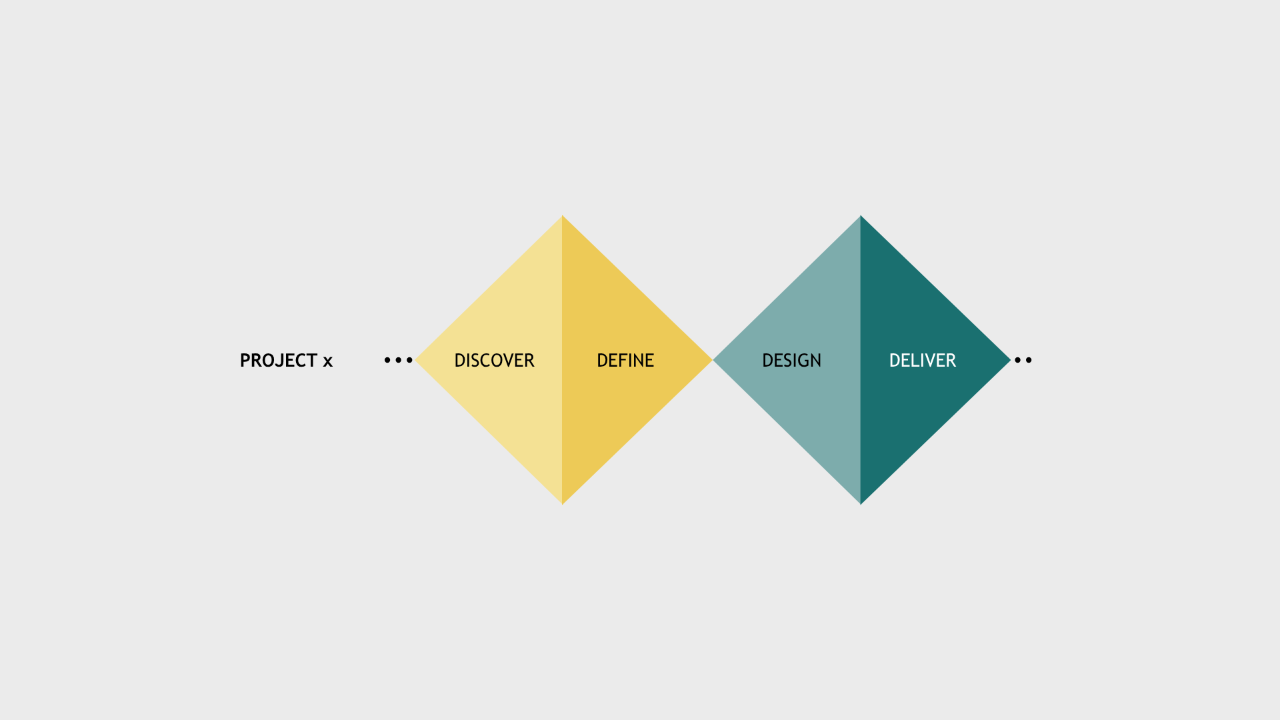
Adoption does not begin at delivery
There is a widespread assumption in analytics that the design process ends when the report is published, and that adoption is what happens after that, a separate phase involving training and communication and change management. In practice, adoption begins much earlier than that, and the decisions that determine whether a report gets used are mostly made before a single visual is configured.
When a user is involved in shaping a solution, they do not encounter it as a finished object that they are expected to receive and understand. They encounter it as something they recognise, because their questions were part of what defined it, their language is reflected in how it is labelled, and their workflow is visible in how it is structured. That recognition is not a small thing. It is the difference between a report that requires an explanation and one that feels immediately familiar.
The earlier a user is brought into the process, the more of that recognition they carry into the delivery moment. And the later they are brought in, the more work the delivery itself has to do, usually in the form of walkthroughs and documentation and follow-up sessions that compensate for the discovery work that was skipped.
From "could be" to "confident it should be"
At the beginning of any project, before research has happened and before users have been consulted, there is only a set of assumptions. You have a rough sense of who the audience is, a hypothesis about what they need, and a collection of available data fields that may or may not map onto any real decision anyone is trying to make. At this stage, the honest position is: we think this might be useful, but we do not actually know yet.
The design process, when it is done well, is the mechanism that moves you from that position to something more solid. Every conversation with a user, every session spent watching how someone currently navigates their data, every moment of asking what happens after you see this number narrows the space of possible solutions and sharpens the picture of what the right one looks like.
By the time you open the tool, you are not guessing at what to build. You are translating something you have already understood into a format the tool can express.
That shift, from uncertainty at the start to confidence at the end, is not accidental: it is the direct result of having done enough discovery to earn it.
Intentional, not lucky
The goal is not to eliminate all uncertainty from a dataviz project, because some things can only be learned by building and testing. The goal is to make sure that the uncertainty you carry into delivery is the productive kind, questions about visual encoding or interaction detail, rather than the costly kind, questions about whether the report is solving a problem anyone actually has.
The organisations that build solutions that last are the ones that treat the discovery phase as the core of the design process, not as a preliminary to it. They understand that a report which genuinely serves its users is almost never an accident. It is the result of someone, early enough in the process to still change direction, choosing to find out what the user actually needed before deciding what to build.
The earlier you involve the user, the less work the delivery has to do. That is not a principle unique to dataviz. But in a field where so many solutions are built in isolation and handed over with good intentions, it is one worth repeating. Reply to this email if it resonates.
See you in two weeks,
Julien