READ TIME - 4 minutes ⏳
Email formatting looks broken? click here to view in browser.
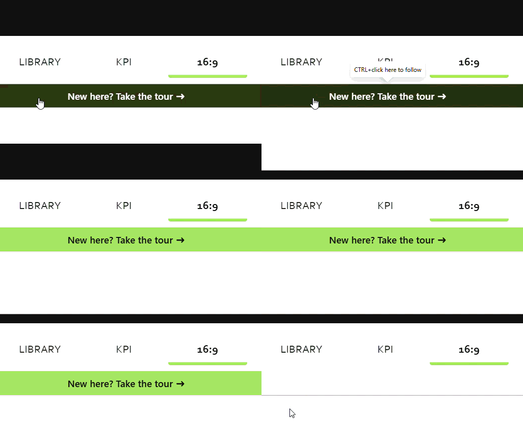
A green button that greets new users, then quietly disappears once they've arrived (no writeback required).
Every dashboard has a first-time-user problem. New viewers land on a wall of visuals with no idea where to start, while returning users don't need hand-holding. Most teams solve this with a static "Help" page nobody clicks, or an intrusive overlay everyone sees forever.
There's a better way, and it uses data you probably already have.
The core idea
Most IT teams log dashboard usage (who opened what, and when) as part of governance. That log is the key. If we load it into the report and check the current viewer against it, we can tell newcomers from regulars.
- New user? Show a tour button.
- Already in the log? Hide it.
And because the log refreshes daily, the button dismisses itself the day after someone's first visit. No "don't show again" state to persist, no writeback plumbing.
The mechanism that makes it feel clean: the button is always on the canvas, it just renders invisible and inert for returning users. Power BI has no measure-driven "hide," but it doesn't need one. A single flag measure drives the button's fill, label, and destination; when the flag is off, every property returns a transparent/blank value and the button effectively vanishes.
Here's the build.
Step 1: Load the governance log
Note: This is a pre-requisite to the feature, but there are plenty of ressources and tutorials available online to help you get there.
Import the usage log as its own table (f_logs) with a user identifier column (userID). Keep it disconnected from the rest of your model with no relationships. You'll query it directly in DAX, and you don't want slicers interfering.
Step 2: Identify the current user
_upn = USERPRINCIPALNAME ()
While building, hardcode this to a value you know is in the log (e.g. "19921212") so you can test predictably. Swap in the live function at the end.
Step 3: The one flag that drives everything
isNewUser =
VAR _user = [_upn]
VAR _matchCount =
CALCULATE (
COUNTROWS ( f_logs ),
REMOVEFILTERS ( f_logs ),
f_logs[userID] = _user
)
RETURN
IF ( COALESCE ( _matchCount, 0 ) = 0, TRUE (), FALSE () )
It counts log rows matching the current user across the entire table; ALL() strips filter context, which matters because a button has no row context. Zero matches means new user.
The trap to avoid: don't use SELECTEDVALUE here. On a button, every userID is in scope at once, so SELECTEDVALUE returns blank and the logic silently fails. An existence check with COUNTROWS( FILTER( ALL(...) ) ) is the right tool.
Step 4: The one flag that drives everything
Drop [_isNewUser] into a card. With _upn set to a value that exists, it should read False. Change _upn to a value that doesn't exist, and it should flip to True. Don't proceed until this toggles correctly. This card is your source of truth; if it behaves, the rest is trivial.
Step 5: Prepare the fill with your design token
Note: here I'm loading a table with design tokens (official design decisions for the company encoded into variables I can re-use across the reports). This why you can see a reference to a table named d_tokens. Don't worry, nothing too fancy! Essentially, it can be stripped down to:
- [tokenID] : the unique identifier for the token (ex:
.color.actionButton.fill.defaultor.color.actionButton.fill.hover - [tokenValue] : the actual value for the token (ex:
"#FFFFFF00"or"#A3E363")
Now that we have cleared "what is a token", here is the how to reference it in a measure:
.color.actionButton.fill.default (tourButton) =
VAR _token =
LOOKUPVALUE (
d_tokens[tokenValue],
d_tokens[tokenID], "color.actionButton.fill.default",
"#A3E363" -- fallback if the token is missing
)
RETURN
IF ( [_isNewUser] = TRUE (), _token, "#FFFFFF00" )
New user gets the green token; everyone else gets "#FFFFFF00", quite uncommon to see an 8-digit hex where the trailing 00 is the alpha channel, but this is how we say "fully transparent" here. This is more reliable than BLANK(), which some Power BI versions render as a default colour instead of truly unsetting the fill.
Step 6: Wire the button
Insert a blank button. On the fx icon beside Fill → Default, choose Field value and select the measure above. Turn Border and Shadow off otherwise returning users see an empty ghost outline (depending on your visual style, you might need to create another measure for the border, in case you design buttons with an outline...).
Then gate the label and the navigation destination with the same IF ( [_isNewUser] = TRUE(), … , … ) pattern, pointing the action at your Tour page.
Tour Button Destination =
IF ( [_isNewUser] = TRUE (), "TOUR", BLANK () )
Step 7: Go live (and the gotcha)
Switch _upn to USERPRINCIPALNAME(). Critical check: that function returns an email ([email protected]), but usage logs often key on a numeric ID. If the formats don't match, nobody matches and everyone sees the tour forever.
Make sure your log stores the same UPN the function returns, or add a mapping table (you may also want to see what the USERNAME()functions returns). Confirm this with IT before publishing, and test in the Service.
Why this matters
This is one small example of a bigger shift: contextual UX inside BI. A report doesn't have to be a static grid of numbers.
Elements can earn their attention, appearing only when there's something worth surfacing.
The onboarding button is step one; the same one-flag engine can drive priority alerts, data-freshness signals, and personalised "since your last visit" summaries...
That's where we're headed next!
See you in two weeks,
Julien