READ TIME - 8 minutes ⏳
Email formatting looks broken? view in browser
I was asked to run a one-hour workshop with a simple-sounding goal: "reduce our dashboard portfolio".
The audience was anything but simple. Around thirty people joined from more than six countries, with different roles, different needs, and very different definitions of what “a good report” even is.

I had less than a week to prepare, and I didn’t get access to end users beforehand (only the internal team). It's a cross-functional group in supply chain responsible for logistics activities in selling points, spanning everything from store-facing digital tools to the data infrastructure underneath (pipelines, semantic models, and operational reporting).
That context matters, because the sentence that kicked this off is deceptively dangerous:
“Let’s kill dashboards people don’t use.”

It sounds like cleaning. But it’s not cleaning. It’s governance. And governance isn’t about deleting things: it’s about deciding what your information system is allowed to become.
The real problem isn’t volume: it’s navigation
Most organizations don’t have “too many dashboards.” They have a navigation problem.
When reporting grows without clear ownership, naming conventions, communication habits, and lifecycle rules, dashboards stop behaving like a library. They behave like a jungle. People stop searching. They ask colleagues for links. They export to Excel because it’s faster than finding the right page. And slowly, the company develops a weird superstition: the data exists somewhere, but only certain people know where.

So the purpose of the workshop wasn’t to run a popularity contest. It was to make the portfolio visible, and to capture signal quickly about what should be sunset, improved, promoted, or migrated into something that shouldn’t be a dashboard at all.
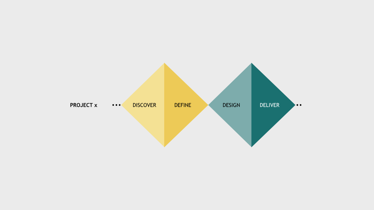
A fast model that users can actually operate
We needed a framework that would work in a single hour, across languages, across roles, across levels of familiarity with Power BI. And it had to do something most “clean-up” initiatives fail at: separate why something is failing from the simple fact that it’s failing.
So I used three lenses, turned into three sticker colors:
-
Green: “We use this.”
-
Blue: “We’re seeing this for the first time today.”
-
Red: “We do not use this! delete it, or migrate it into our digital products' interfaces instead.”
This sounds almost childish. It’s not. It’s a cleverly compressed diagnostic tool.

Because when someone says “this dashboard is bad,” they could mean ten different things. It could be irrelevant. Or confusing. Or slow. Or good but invisible. Or used, but hated. The stickers force people to be more explicit, without requiring them to be analysts.
And the moment you put that on a wall, patterns appear instantly.
Scoping: don’t bring the whole jungle into the room
Of course, you can’t print “everything.” You only have an hour. So before the workshop, we narrowed the scope using the minimum viable set of portfolio analytics.
Over a six-month window we collected basic signals like:
-
Total views (how often reports are opened)
-
Unique users (how many distinct people touched them)
-
Exports (how often people pulled data out to use elsewhere)
If you can, you can add operational signals too. Numbers about support tickets, recurring bugs, refresh failures, capacity/cost indicators... but we didn’t have time to gather everything. The important part is the mindset:
you’re not trying to build the perfect measurement framework. You’re trying to choose candidates that are worth user attention.

We also applied a few sanity filters. We kept the exercise focused on official user-facing reports (published in the App), and excluded internal-only items. The goal was to audit the portfolio people actually experience, not the artifacts only your data team knows about.
At this stage, we kept the tracking intentionally simple: a Google Sheet as a single source of truth. No meta-dashboard. No overengineering. Just a place to centralize what we know, what we’re testing, and what we’ll decide later.
If you’re tempted to build a “dashboard about dashboards,” you’re not alone. But it’s usually the exact behavior you’re trying to stop.
The war room: turning digital clutter into physical evidence
Then we did something that feels low-tech and slightly ridiculous (until you try it).
We printed the selected dashboards. Not screenshots, not slides. The actual pages, exported as PDFs, then printed and duck-taped. We grouped them by theme or value stream and taped them onto the walls of a meeting room until the room became a gallery of your reporting reality.

This does two things.
First: it removes the illusion that your portfolio is “not that big.”
Second: it creates a shared reference point. Nobody can argue in the abstract when the pages are literally in front of them.
Here's what the printouts looked like on ONE wall from the room:

A small but important detail: we froze the materials. We made copies of the report exports so analysts wouldn’t “quick-fix” things during the audit and accidentally change the baseline. If a title has had a typo for six months, it can survive one more week. Right now, you want a static snapshot.
How the session actually ran
The workshop itself was tightly timed:
- A short intro to align everyone on the goal and the rules.
- Then the main event: sticker time.
- And a short close to explain what happens next, because users will only keep playing along if they believe something will change.

We split our 30-people group into subgroups (in our case, it naturally aligned with business units). We set up multiple “booths” in the room: each booth representing a value stream grouping of reports, and rotated groups through them.
Each group had about ten minutes per booth to review pages and place stickers. Ten minutes is… brutally short. If I were doing it again, I’d extend it. But constraints are part of the point: the system has to work even when time is limited, because time is always limited.
This is where the roles matter. You need a timekeeper to keep rotations honest. And you need a member of your internal team at each booth, not to influence votes, but to capture the comments that stickers can’t explain:
-
“What is this page for?”
-
“Is this KPI calculated with or without this subset?”
-
“We don’t use this anymore... we built our own.”
-
“I have never seen this page.”
Stickers tell you where the friction is.
Comments tell you why it exists.
And that “why” is what turns a cleanup into a redesign.
After the stickers: converting paper into decisions
When the hour is over, the work isn’t. You now have a room full of pages covered in tiny signals, and the worst thing you can do is treat it like a fun workshop artifact and move on.
So I digitized it.
Ha! How nostalgic was I... It brought me back to the early days of my career as an intern. Some pages even freaked-out during scanning by how manual and time consuming this process was :O

I scanned all printouts back into PDFs, imported them into a Miro board, and “exploded” them into individual frames with one frame per report page. Then renamed frames consistently (ReportName | PageName), and tagged observations directly onto the visuals while the memory was still fresh.
Pro tip: If your reports are stored as PBIP, you can go one step further and extract page metadata from the folder structure to build a clean mapping table. That mapping is what lets you aggregate sticker counts at multiple levels later:
-
Workspace level (how healthy is the portfolio overall?)
-
Report level (which reports are candidates for sunset/improve/migrate?)
-
Page level (which specific screens are confusing or unusable?)

This matters because dashboards don’t fail as whole objects. Often, a report is “fine” but has two pages that cause 80% of the confusion. Without page-level evidence, teams tend to overreact: either delete too much, or fix too little.
What this workshop is really buying you
If you do it right, you end up with something most dashboard cleanups never achieve: legible tradeoffs.
Below are some slides I presented to the Management team that enrolled me into this project.
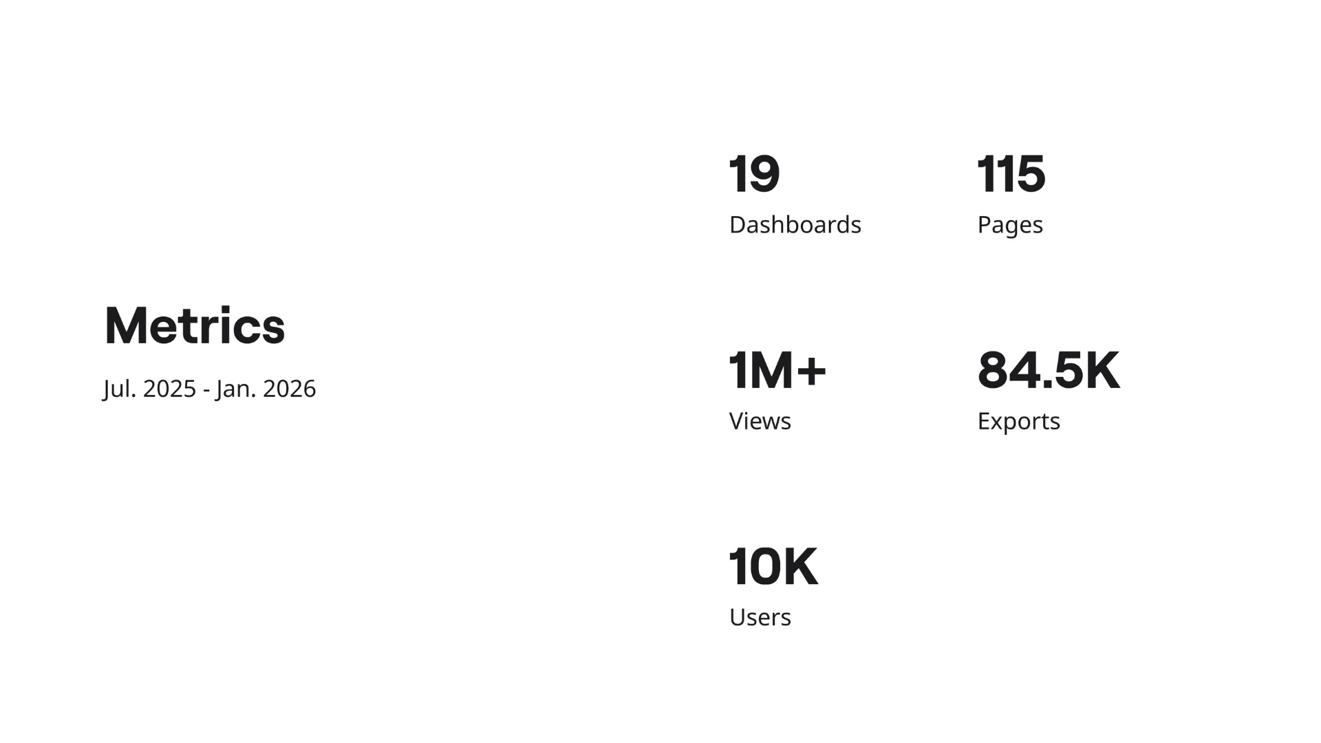
Measurements
This was my opening slide: aggregated portfolio stats over a six-month period. Even with just these five metrics, a story emerges immediately, and everyone in the room reacted the same way.
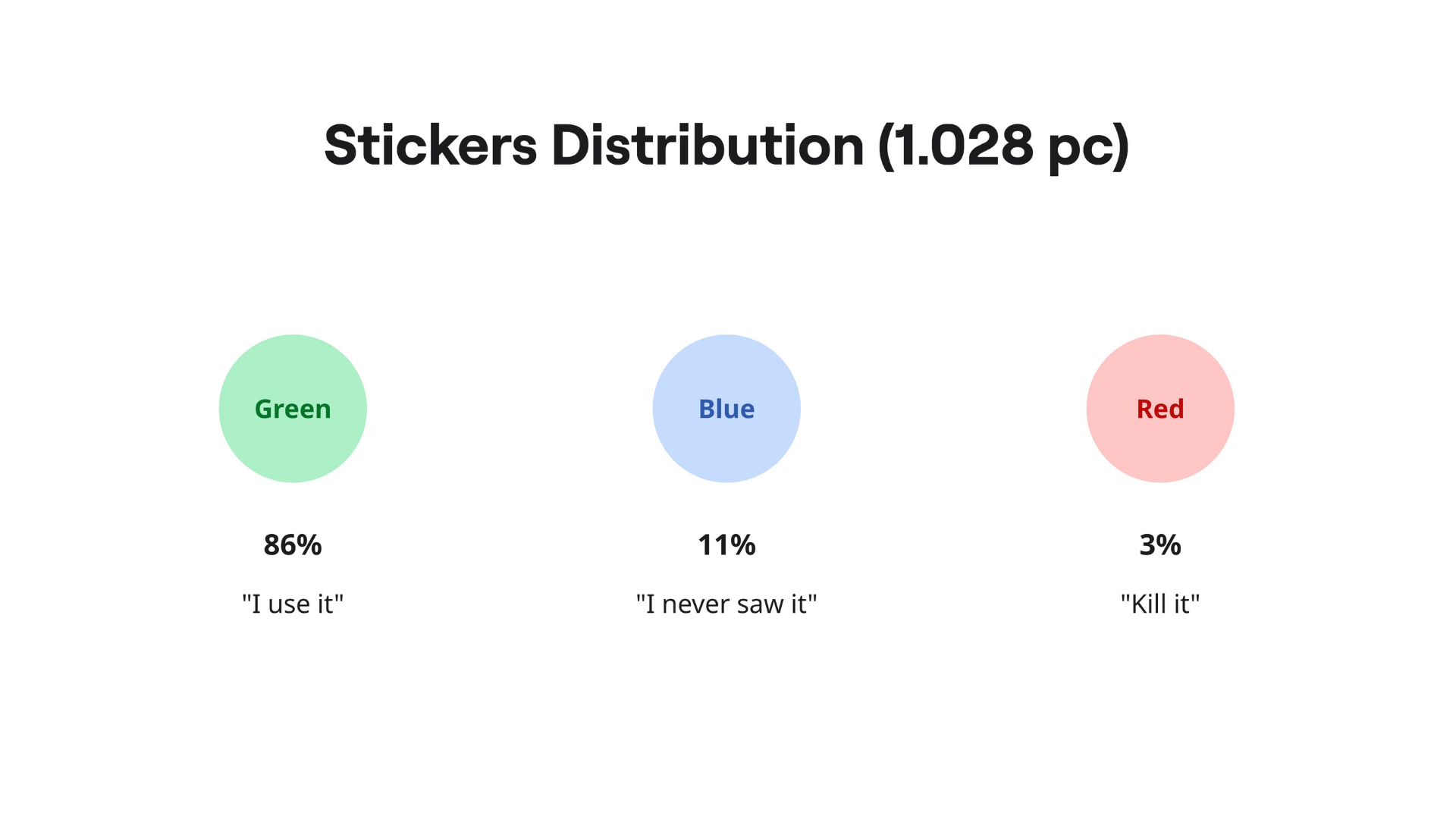
Facts
There’s a huge gap between feeling adoption is low and being able to prove it. This slide turns about ten days of audit work into three numbers that are hard to ignore (and easy to remember).
Conclusion & next steps
Finally, I grouped the reports into clusters based on their profiles. That clustering wasn’t the end result but the start of the real work: deciding what we sunset, what we improve, what we actively promote, and what we migrate into a digital product. And lastly, prioritizing effort where it will actually move the needle.
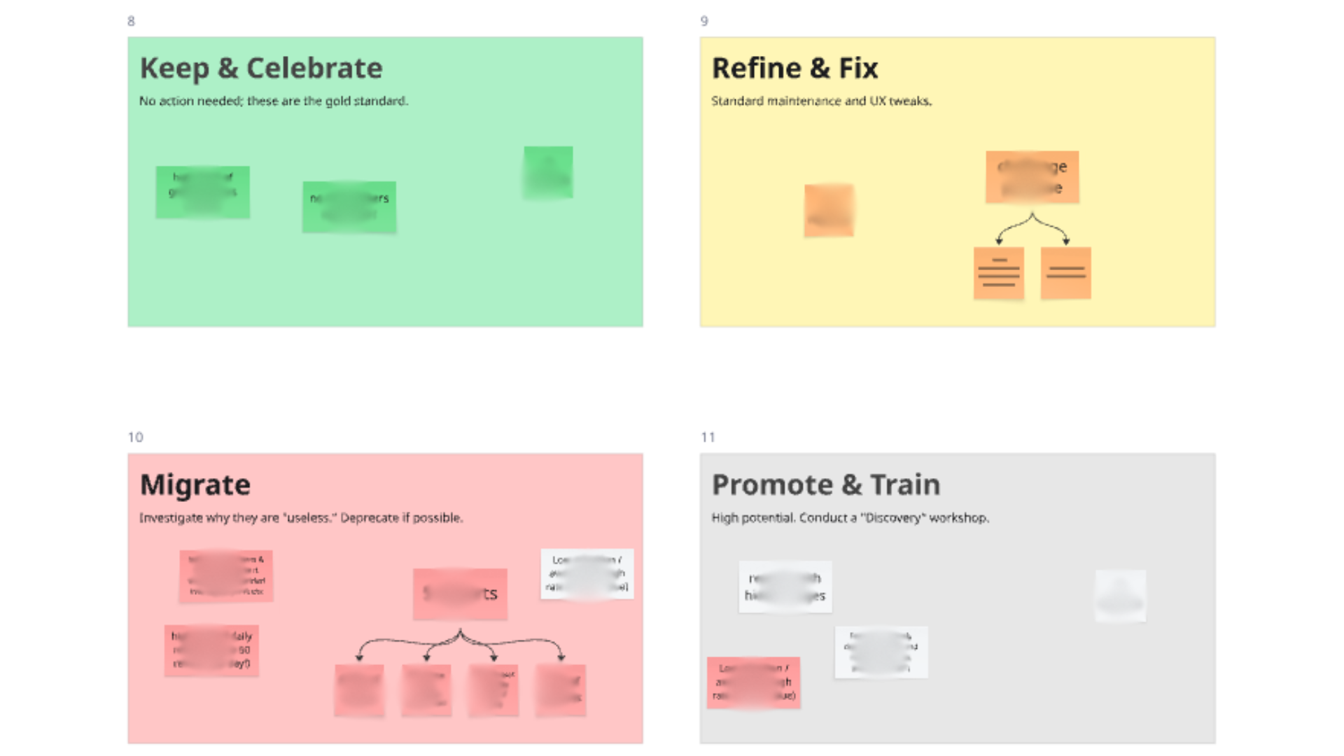
🟢 Keep & celebrate | 🟡 Refine & Fix
🔴 Migrate | ⚪ Promote & Train
I’m working on a longer-form article that lays out the full method and the follow-through: from scoping the portfolio, to running the sticker session, to converting the results into concrete decisions (sunset, fix, promote, migrate-to-product).
If your team is dealing with dashboard sprawl and you’re looking to operationalize a process like this, I’m available to help implement it in your context: reach out and we can see if it’s a fit.
Cheers,
Julien