READ TIME - 6 minutes ⏳
Email formatting looks broken? click here to view in browser.
Ten months ago, I published a post that felt like a small risk where I introduced the concept of a Power BI design system. My own, built over years of client work and promised to share it gradually, in pieces, in public. That post was also a promise to myself: to show up more, to make the thinking visible, to stop keeping the framework inside project folders and client workshops.
Since then, the system has had a name. It is called Culture.
Why that name
Most Power BI deployments focus on the technical layer: connecting data sources, building models, publishing reports. Some go further and address the visual layer: consistent colours, cleaner layouts, better chart choices. Very few address what sits underneath both of those: the organisational layer. The shared understanding, the common language, the agreed standards that determine whether a team of five developers produces five coherent experiences or five completely different ones.
That organisational layer is culture. And culture, in the context of data visualisation, is not a soft concept. It is a set of concrete things: documents, templates, rituals, principles, deliverables. Things you can build, share, teach, and update: things that compound over time.
The framework I use to describe it has four components, arranged not as a hierarchy but as a Venn diagram, because in "practice" (no pun intended), they overlap and reinforce each other.
Here's another acronym for ya': PPPP!
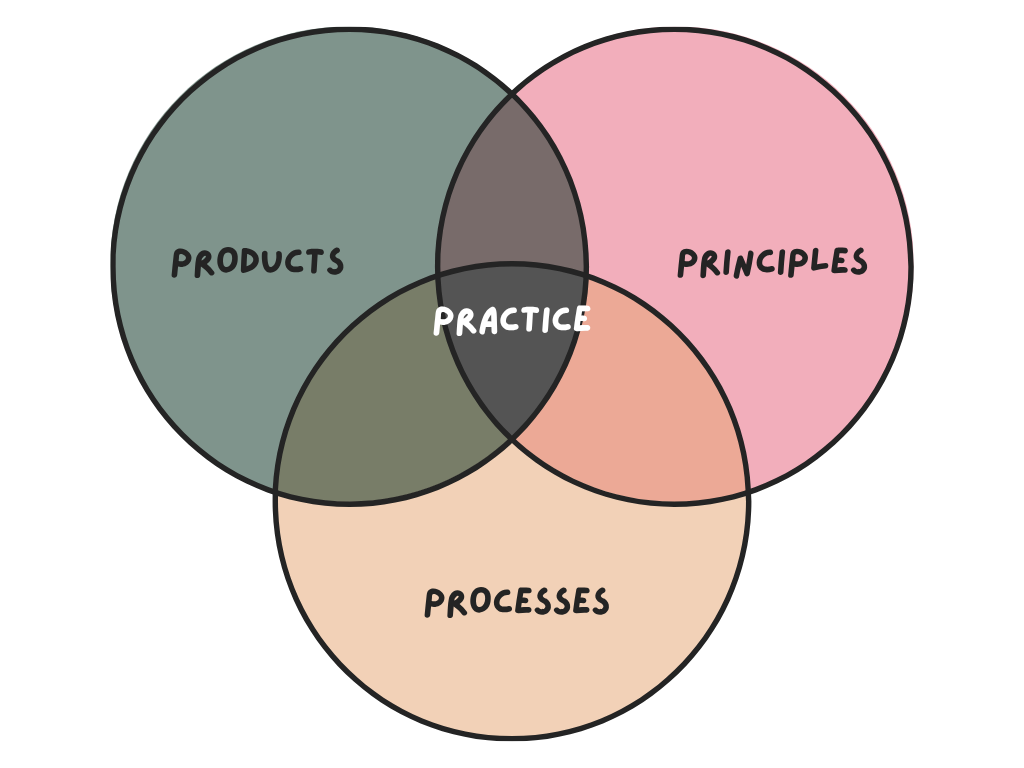
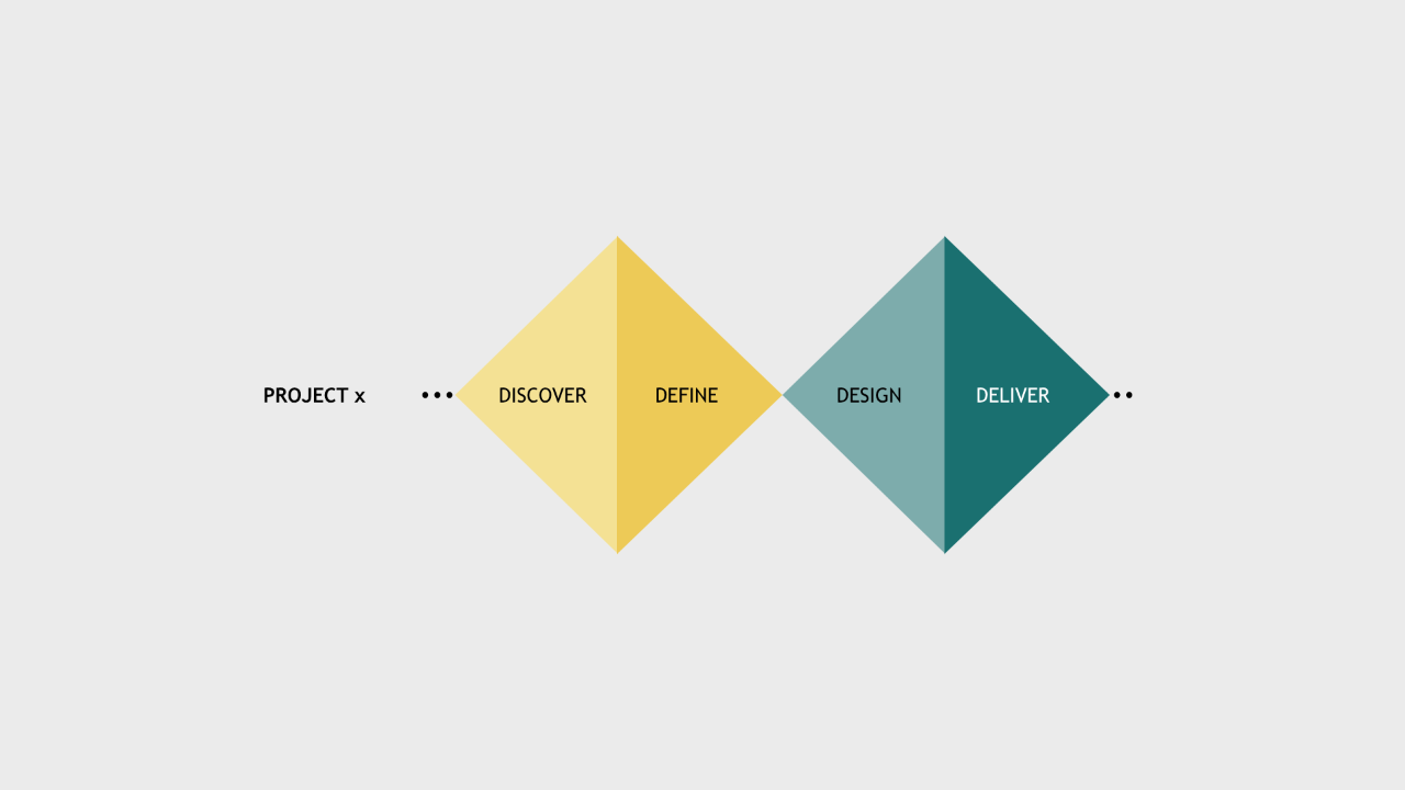
Products are the tangible outputs of a design culture: the themes, the templates, the component libraries, the report standards. Things a developer can open, apply, and build on. In my system, these are organised around what I call the "TTT model": Themes, Templates, and Tokens. It's three layers that give Power BI developers a coherent building framework without constraining every design decision they make.
Process is how work gets done: the brief before a build starts, the review before a report goes live, the feedback loop after it has been used. Without process, even the best Products get applied inconsistently. With it, standards become habits.
Principles are the reasoning behind the decisions: the "why" that makes a team capable of making good new decisions when the templates do not cover the situation. Principles are what prevent a design system from becoming a rigid rulebook and keep it alive as the organisation's needs evolve.
At the centre of all three, where they overlap, sits Practice.
Practice is what happens when Products, Process, and Principles are used together long enough to become instinct.
It is the developer who no longer searches for solution because there is a community within the organization with rituals and people no longer work in silos. The analyst who starts a project with a brief because that is just how projects start. Practice is culture made operational.
What this looks like in the real world
The Themes, Templates, and Tokens model (TTT) is now being deployed at clients. Developers arrive at a project with a structured building framework instead of a blank canvas and a corporate colour palette pasted into a sticky note. The time saved on low-value formatting decisions goes back into the work that actually matters: understanding the user, framing the question, designing the flow.
The feedback from the community has been more than I expected. The DMs I receive most often say some version of the same thing: "this changed how I think about design and report building entirely." That is the response I hoped for when I started writing publicly, not "this is a useful trick" but "this is a different way of seeing the problem." That shift is what Culture is designed to produce.
Going more public
Publishing was the first step. The second was speaking.
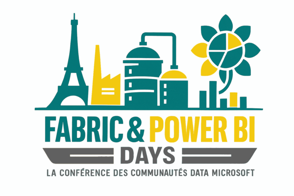
About a month ago I joined the Design Donderdag podcast for a conversation about design systems in Power BI: my first "live appearance", which did not come naturally. But it went well enough that I am doing it again, this time in person! In June I will be presenting a deeper dive into the Culture ecosystem at an event in Paris. More details coming soon, but if you are in or near Paris in June, keep an eye out.
My plan from here is to do more of this; demos, walkthroughs, live sessions that show not just what the system produces but the reasoning that went into building it. The framework is only useful if people can understand it well enough to adapt it to their own context, and documentation only goes so far. Showing the thinking in real time is the part that written articles cannot fully replace.
Why this matters beyond the tool
Power BI is a means to an end. The end is an organisation where people trust their data, understand their reports, and make better decisions because of both. Getting there requires more than a good data model and a clean colour palette. It requires a shared culture:
- Products people use,
- Processes people follow,
- Principles people understand,
- and Practice that makes all three feel effortless.
That is what Culture is built to deploy. And the most encouraging thing about the past ten months is that the organisations putting it in place are starting to feel the difference.
More coming. In the meantime, if this resonates, or if you are working through something similar in your own organisation, reply to this email. I read everything.
See you next week,
Julien