READ TIME - 7 minutes ⏳
Email formatting looks broken? click here to view in browser.
Every Power BI project contains a moment where a report builder makes a judgment call (usually quietly and often quickly!) about what kind of thing they are actually building.
- Is this a dashboard or an exploratory tool?
- Should this be optimised for a monitor or a phone?
- Does the user need to drill into detail or just confirm a number?
These decisions are made dozens of times across a project, and they compound. Get them right and the report feels inevitable, like it was designed specifically for the person using it. Get them wrong and you end up with something technically correct that nobody opens twice.
The entry point to getting them right is almost embarrassingly simple: spend time with your users before you design anything.
This sounds obvious. It is not practised as often as it should be, and when it is skipped, the consequences ripple through every subsequent decision: the choice of visual container, the measures collected, the navigation structure, even the chart types. Understanding who your users are and what they are actually trying to do is not a soft, optional extra. It is the load-bearing foundation on which everything else rests.
The first question: what kind of report are you building?
Power BI is a flexible platform, and that flexibility is a trap if you do not know what you are building before you start. The term "report" covers a wide range of fundamentally different objects, and each one is designed around a different user relationship with data.
An exploratory report is built for users who want to interrogate the data themselves. They apply filters, cross-highlight, change dimensions, follow unexpected patterns. They are investigators. The design priority is freedom of movement, not visual clarity at a glance.
A monitoring dashboard (a cockpit in the older BI vocabulary) is built for users who already know what they are looking for. They check it the same way a pilot checks instruments: quickly, habitually, looking for deviation. The design priority is signal density and immediate legibility. Decorative elements, deep navigation, and complex interactions all work against it.
A mobile report serves users who are away from a desk, often checking one specific number or status before a meeting or a decision. The design priorities are loading speed, tap-friendly interaction targets, and extreme information hierarchy. What belongs on a mobile surface is almost always a subset of what belongs on a desktop one.
None of these modes are better or worse. They serve different user needs, and the mistake is designing one when users need another. The way to avoid that mistake is to ask the users directly: not what they want the data to look like, but what they actually do with it, and when, and where. Using charts in a slide deck, attaching a report in a mail or printing a report page are 3 different usage for a dataviz solution, and each can be designed differently.
The content question: what measures do you actually need?
Once you understand the user and their context, a second category of decisions becomes much easier: what to build. Most Power BI projects accumulate measures the way drawers accumulate cables: out of optimism and a vague sense that something might be needed. The result is a data model that is technically comprehensive and practically overwhelming.
The 3-30-300 framework is useful here. The idea is simple: a senior leader probably spends three seconds on a report before deciding whether it is relevant. An analyst might spend thirty. A specialist drilling into a specific area might spend five minutes or more. These three modes require very different things from the same underlying data.
- The three-second view needs one or two headline numbers, clearly labelled, with an obvious comparison point.
- The thirty-second view needs context: trends, segmentation, a sense of what is normal and what is not.
- The five-minute view needs the ability to get genuinely granular.
Collecting the right content components (the right measures and columns) means understanding which of these views your users actually occupy, and designing the data model to serve that rather than to serve every possible question a future analyst might one day ask. Scope creep in data modelling is just as damaging as scope creep in any other part of software development.
The display question: why the default chart is usually the wrong answer
There is a tendency in Power BI to reach for the line chart. It is familiar, it is clean, it is easy to explain in a status update. It also answers a specific question: how does this value change over time? If that is not the user's actual question, a line chart is the wrong answer, regardless of how clean it looks.

A waterfall chart answers a different question: where did this total come from, and what added or subtracted from it? A scatter plot answers: is there a relationship between these two variables? A small multiples layout answers: how does this pattern vary across different segments? These are not exotic choices... they are the natural responses to specific analytical questions.
The problem is that most report builders never get close enough to the user's actual question to realise a different chart type would serve it better.
Spending time with users changes this. When you sit with someone while they use a report, you see where they pause, where they add a column to a table in Excel after exporting, where they say "I just need to know how much of that is attributable to X." Each of those moments is a signal about the question being asked, and therefore about the chart that would answer it.
Choosing the right visual is not only a design decision: it is an analytical one. The design just makes the answer legible.
The navigation question: reducing the distance to insight
User understanding also shapes the structural decisions in a report: where information lives, how users move between views, and how quickly they can get from a question to an answer.
Power BI offers genuine navigation tools like drill-through pages, cross-report navigation, bookmarks that capture a specific analytical state. These are not features to add as an afterthought; they are the architecture of a coherent user flow. But they only work if you know where users start, what they are looking for, and what they will want to see next.
A well-designed drill-through is the difference between a user exporting a table to Excel and a user getting their answer without leaving the report. Cross-report navigation, when done thoughtfully, allows a single platform to serve multiple audiences without forcing everyone into the same analytical context. The monitoring user stays in the cockpit view. The analyst follows a link directly to the detail. Neither has to fight through an interface built for the other.
Getting this right requires knowing the user's workflow, not just their data requirements. It requires understanding the sequence of questions they actually ask: what triggers the next question, and where they expect to find its answer.
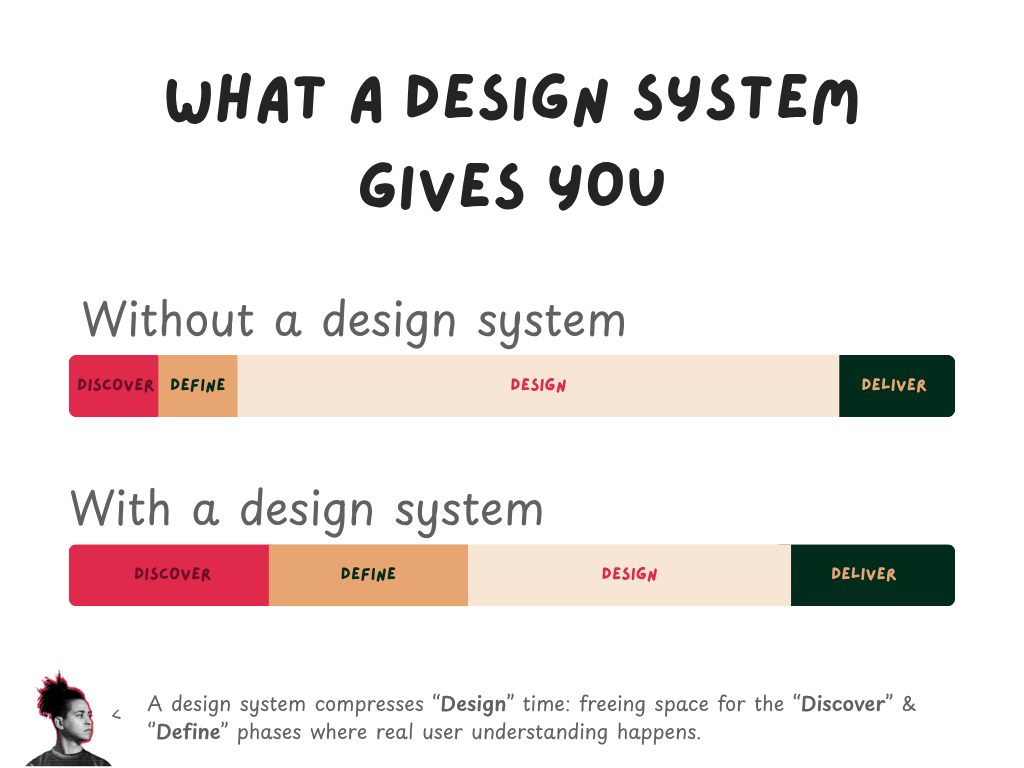
What a design system actually gives you
There is a common misconception about design systems in Power BI: that they are primarily about visual consistency. They are, but that is a secondary benefit, the primary benefit is time.
When colours, typography, spacing, component sizing, and layout patterns are defined and reusable, the mechanical work of building a report shrinks dramatically. You stop making the same decisions repeatedly. You stop second-guessing whether this card should have a border. You stop rebuilding the same header layout from scratch.
The time that releases does not disappear. It moves. It moves into the activities that design systems cannot automate: discovery conversations with users, iteration on information hierarchy, testing a navigation flow to see if it actually makes sense to the person who will use it. Design systems do not reduce the value of design work but they eliminate the low-value parts of it so the high-value parts can happen more often.
Involving users during design: the Crazy 8 exercise
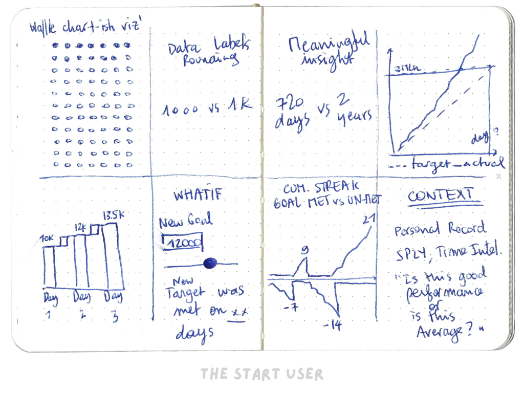
The best time to discover that your information architecture is wrong is before you have built it. One technique for surfacing good ideas quickly and for inviting users into the design process before a single visual has been created is the Crazy 8 exercise. Below is one I've made myself to explore new insights I could get from a daily habit I'm tracking:
Take an A4 sheet of paper and fold it in half. Fold it again. Fold it once more. When you unfold it, you have a sheet divided into eight panels. The exercise is straightforward: eight minutes, eight ideas, one per panel. The constraint matters: you are not producing polished sketches, you are generating quantity. The goal is to make the idea-generation phase feel low-stakes enough that genuinely unusual ideas appear alongside the obvious ones.
What makes the exercise more generative in a group setting is the circulation step. Once each participant has filled their first panel, they pass the sheet to the person on their right. The next person continues the exercise: either building on the ideas they have inherited or using them as provocation to go somewhere different. The sheet circulates until the time is up.
Run this at the start of a project, before any report page has been opened, and you will surface user mental models that would otherwise take months of post-launch feedback to discover. Users know what they need before they can articulate it; the exercise gives that knowledge a form.
The output is not the sketch but a conversation the sketch provokes. When someone draws eight panels and one of them is a single large number with an arrow next to it, that tells you something about what they actually want from the report. When someone sketches a filtering interface that does not exist in Power BI, that tells you what the data interaction model needs to approximate, even if not perfectly.
The compounding return on user investment
None of this requires a research budget or a UX team. It requires a mindset shift: that understanding users is part of the build, not preparation for it. An hour of structured conversation before a project starts repays itself many times over in reduced rework, clearer scope, and reports that get used rather than avoided.
Every downstream decision (the container type, the data model, the chart selections, the navigation logic) becomes easier and more defensible when it traces back to something a real user actually said or did. The report stops being a technical exercise and starts being a designed response to a known problem.
That is the difference between a report that gets opened and one that only gets bookmarked.
The distance between a number on a screen and a decision being made is not a data problem: it is a design problem. I help organisations shorten that distance: through custom Power BI design systems, clear visual standards, and hands-on coaching that builds the capability internally.
If reducing time to insight is on your agenda, let's talk.
See you next week,
Julien