READ TIME - 10 minutes ⏳
Email formatting looks broken? click here to view in browser.
I recently sent a client a 5 minutes video. Just a side-by-side of their report before and after I redesigned one visual. That one comparison changed the entire scope of our collaboration. Here is the full story.
Your eyes are lying to you
There is a dirty secret in the world of business reporting. Most dashboards are not designed to help you think. They are designed to show you data. And those two things are very different.
Imagine walking into a cockpit where every dial looks the same. Same size, same color, same position. Nothing tells you what is urgent and nothing tells you what is fine. You have to read every single instrument, one by one, and figure it out yourself. That is what most Power BI reports look like today. They display data, but they do not communicate insight.
A few weeks ago, I sent them two short videos: simple before-and-after comparison of couple of their visual. I could have written a long email explaining every design choice, but let's be honest, nobody reads those with enthusiasm, no matter how good the screenshots are.
So I made it fun. Before showing the reworked visual, I asked them one question:
"Can you, in 3 seconds, spot the month where you performed worse compared to the same period last year?"
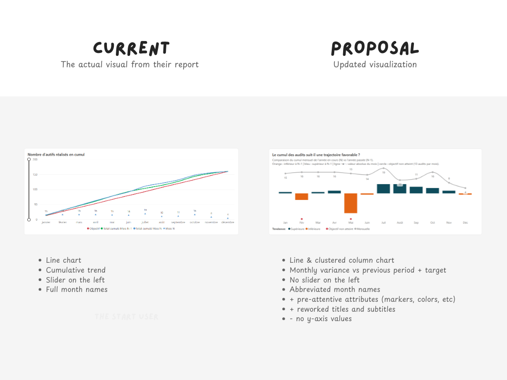
One the question asked, I paused the demo. Below, you can see it. On the left, their current setup. On the right, my proposal.
This media changed the entire scope of our collaboration. But to understand why, you need to understand what was broken in the first place (and how I approached fixing it).
Three lines walk into a chart
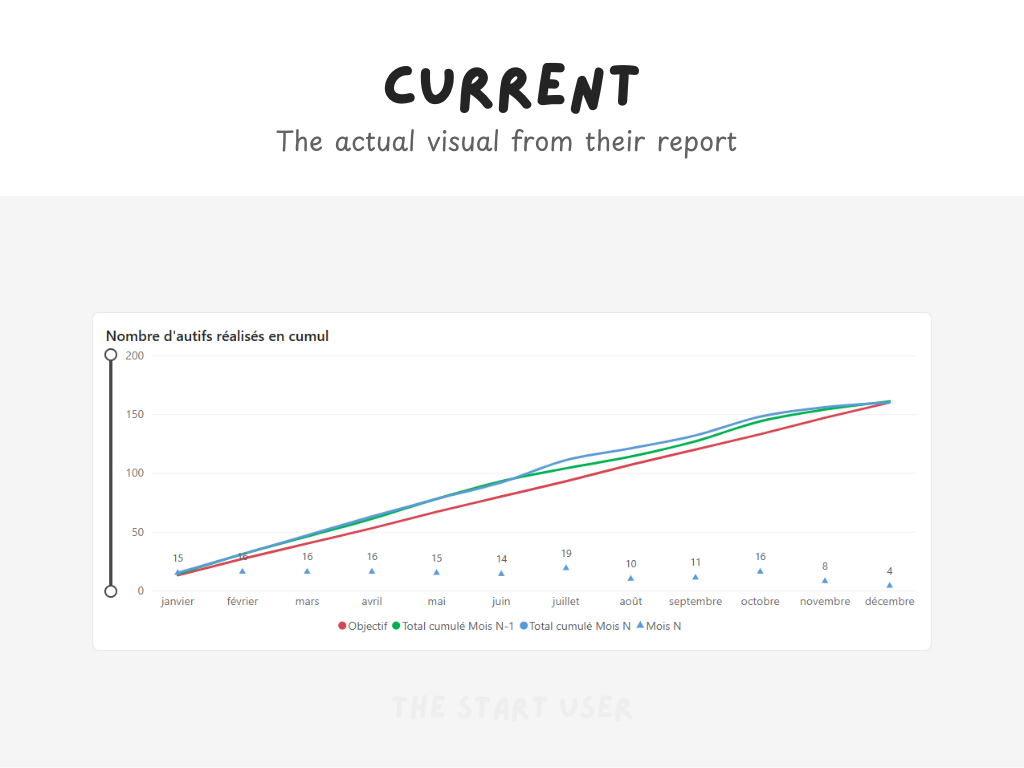
The original report used a classic line chart. Three lines on the same axis, tracking a measure over time:
- the current year,
- the previous year,
- and the target.
It is an obvious choice. It is what most people would build. And that is exactly the problem.
When you put three lines on the same chart, you are asking the reader to do mental math. You are asking them to look at the gap between two lines and estimate how big it is. You are asking them to follow curves that cross each other and remember which color is which. You are asking them to move their mouse over a data point, wait for a tooltip to pop up, read a number, then move to the next point and do it again.
That is not analysis, but effort disguised as information...
The insight was technically there. But it was hiding behind pixels and overlapping trends, waiting for someone patient enough to decode it. In a world where people make decisions in seconds and meetings run on tight agendas, "technically there" is not good enough.
Before you redesign anything, listen first
Here is something I learned the hard way: you cannot walk into an organization and start redesigning their reports based on best practices alone. Best practices do not know your users, it does not know what scares your stakeholders and worse: best practices do not know that the last time someone changed the dashboard, half the team went back to Excel.
So before I touched a single visual, I sat down with the Power BI team. Not to audit them, not to grade them but just to listen.
I asked them how they build reports. How new requests come in. What frustrates them during development. What happens when a user says "I do not understand this chart." It was an open conversation, and it revealed something critical: the team was not lacking skill. They were lacking a system. Every report was almost built from scratch, color chosen on the fly, every layout decision made in isolation.
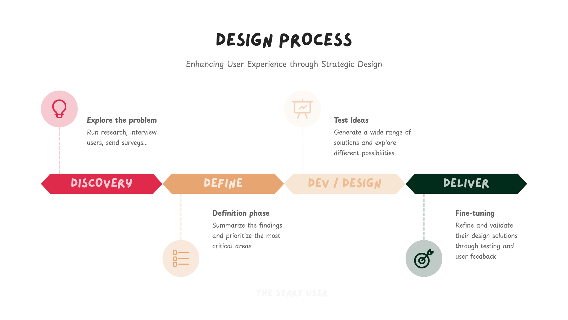
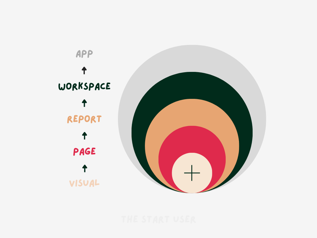
Then we pulled the usage data from their Power BI tenant. Number of users, unique views, report counts, apps, semantic model connections, percentages of reports still not optimized. We looked at which visual types were used the most, which reports were the most popular, how many visuals lived on a single page (this is called the discovery phase).
The results told a clear story. Their top three visuals were line charts, tables, and slicers. Think about what that means. Users come in, select their scope with a slicer, then stare at a table to get the full picture because the charts alone are not giving them what they need. They default to the table because they trust raw numbers more than a few ambiguous pixels on a line. That is not a Power BI problem: that is a design problem, and it told me exactly what I had to solve.
Attention magnets and the art of not making people think
The new visual I proposed is built on two foundational shifts.
The first shift is about what we show. Instead of plotting raw values on three lines and letting the reader figure out the story, we preprocess the data.
- We calculate the difference between the current performance and the previous year.
- We calculate the gap between the current performance and the target.
That gives us two layers of meaning baked directly into the visual. One tells you how you compare against where you were. The other tells you how on track you are against where you want to be. The reader no longer has to do the math. It is already done.
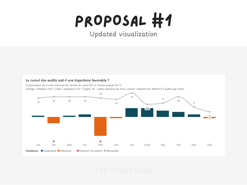
The second shift is about how we show it. I replaced the standard line chart with a combo chart. Columns for the deltas , lines for the absolute values. But the real magic is not in the chart type. It is in what I call attention magnets: pre-attentive attributes like shape, direction, color, and symbols that the human brain processes before conscious thought kicks in.
Here is how that works. Your visual system, the part of your brain that processes what you see, is incredibly fast. It can detect a red dot in a field of blue dots in milliseconds. It can spot an arrow pointing down in a row of arrows pointing up without you even trying. These are not design tricks. They are how human perception works. And when you use them intentionally in a chart, you create something powerful. The user no longer scans the visual looking for the story. The story jumps out at them.
In the old chart, you had to eyeball the performance. In the new one, a downward red arrow next to a column instantly tells you: this metric is below target and declining. You do not need a tooltip. You do not need to hover. You do not need to compare two lines with your eyes. The visual does the work for you.
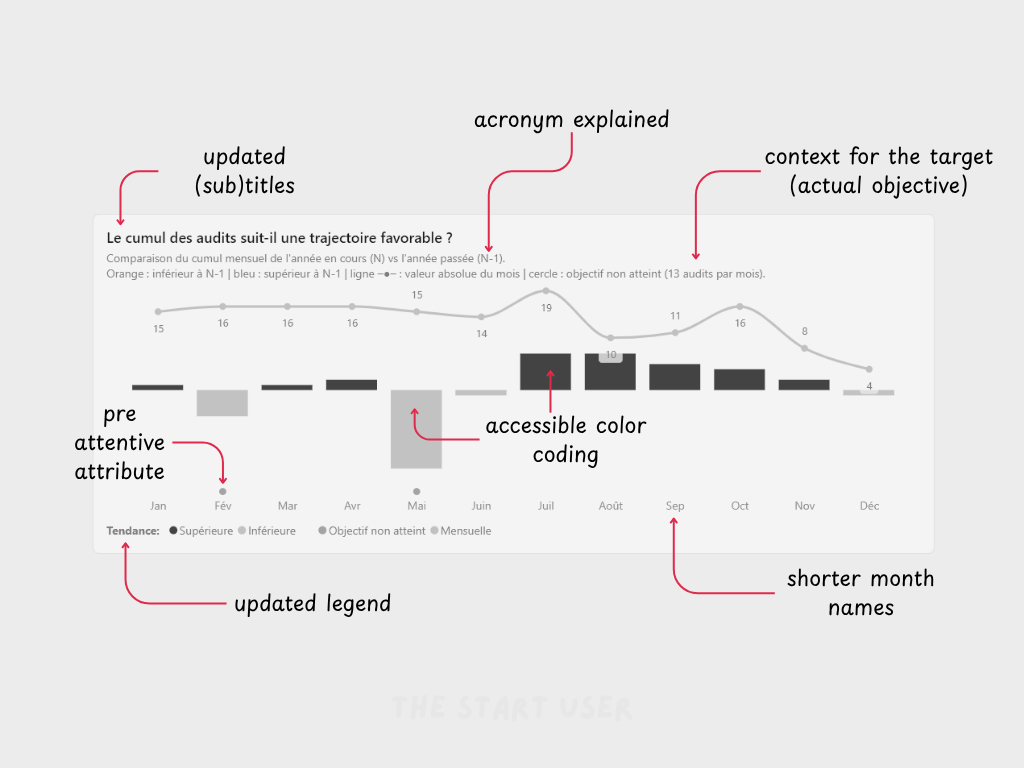
And because I built this using a design token system, every color, every symbol, every style choice is centralized. If the client decides tomorrow that they want to change their palette, one update propagates everywhere. No report-by-report editing. No inconsistency, "it just works!". See the white and black version below to show how accessible it is now:
The "color rebellion"
Now here is where it gets tricky. The client had an existing color convention:
- Red for the target.
- Blue for the current year.
- Green for the previous year.
And management was very clear: "do not change too much at once".
But here is the thing about those colors. In data visualization, colors carry meaning whether you assign it or not. Red is universally associated with danger, alert, underperformance. When you use red for the target line, you are unconsciously telling the reader that the target is a bad thing. Green signals positive outcomes, growth, success. Using it for last year's performance implies that the past was always good. Blue is neutral, cold, functional, often used for interactive elements like buttons and links.
Their color system was fighting against how human brains read color. It was not wrong in a technical sense. There is no law that says red must mean "bad." But it was creating unnecessary cognitive friction. Every time a user looked at the chart, their instinct said one thing and the legend said another. That tiny conflict, repeated hundreds of times across dozens of reports, adds up to slower comprehension and lower trust.

So I proposed a shift: the new colors respect the emotional weight that each hue carries. Red becomes now orange and means what "warmer colors" should mean. We're now using a cold color as its opposite (navy blue). And critically, these colors are not just a suggestion in a style guide somewhere. They are encoded directly into the template and documented as design principles. When someone creates a new report, the right colors are already there. The decision is made for them which a huge improvement already.
This is the difference between accidental standardization and intentional standardization. In the old world, two reports looked the same because the developer happened to copy from the same source. In the new world, two reports look the same because the system guarantees it.
The no-brainer test
When I took on this project, management gave me a constraint that turned out to be the best brief I have ever received. They said: "We already had a hard time getting people to move from Excel to Power BI. Do not make it worse."
That sentence shaped every decision I made. I was not just designing a better chart, but I was now designing a reason to stay. Every visual had to pass what I call the no-brainer test: is this so clearly better than what existed before that no one would want to go back?
That is a high bar. Because "better" in a design sense does not always mean "better" in a user adoption sense. You can create the most elegant, information-rich visualization in the world, and if it feels unfamiliar or intimidating, people will close the tab and open their spreadsheet. The goal was never to impress, but to make the old way feel like going back to a flip phone after using a smartphone.
And when I sent that before-and-after video, the response confirmed it. Despite the new colors, despite the new chart type, despite the additional layers of information, the feedback was overwhelmingly positive. The Power BI team did not feel like I had taken something away from them. They felt like I had given them a superpower.

One chart changed the conversation
Here is what happened next. Because that single visual landed so well, the conversation expanded. What started as a design system project, focused on standardizing colors, encode a theme file and define layouts, grew into something much bigger.
My client is now looking at how the entire organization uses data day to day. Not just how reports look, but how data flows into decisions. What should the data management architecture be? How do we embed data into digital products? How does data become the starting point for discussions about new processes, new contracts with customers, new agreements with suppliers?
That is the trajectory I have seen again and again:
You start with one chart ➜ you fix the visual ➜ then you fix the system behind it ➜ then you fix the culture around it.
Data visualization is never just about the picture. It is the front door to how an organization thinks.
And if the front door looks confusing, people will not walk in.
If your reports are technically correct but nobody is using them, the problem is not the data. It is the design. I help organizations turn their dashboards from data dumps into decision-making tools through custom design systems, visual standards, and hands-on coaching. If that sounds like a conversation worth having, let's talk.
See you next week,
Julien