READ TIME - 4 minutes ⏳
Email formatting looks broken? click here to view in browser.
One design habit that seems harmless in Power BI, but becomes surprisingly difficult to manage once a report grows, is using transparency as part of the actual color system, especially for backgrounds.
A common example is choosing a neutral grey for a visual background and then adjusting it with a transparency parameter until it “looks about right.” In a single mockup or on a single visual, that can feel efficient. In a real Power BI report with multiple visuals, containers, panes, states, and themes, it often becomes inconsistent very quickly.
Why transparency breaks consistency
The first problem is visual consistency. A transparent grey is not a fixed color; it is a color mixed with whatever sits underneath it. That means the final result depends on context. If the same semi-transparent grey is placed on a white page, inside a container, over a tinted wallpaper, or on top of another surface treatment, it will not necessarily look the same.
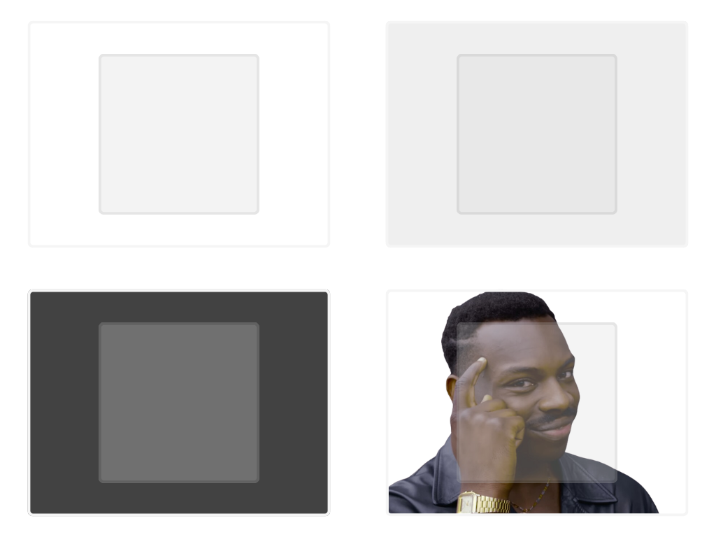
Most dataviz tools allows page wallpaper and background styling, and those surrounding surfaces can influence the perceived result of transparent fills, which makes the color less stable than it first appears.
The Power BI problem
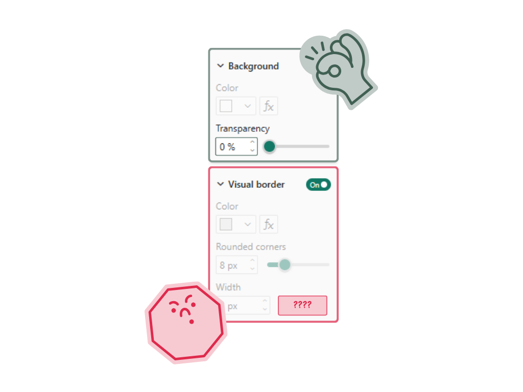
The second problem is more specific to Power BI: you may not be able to apply the same transparency logic everywhere, even when you want to. Power BI does provide transparency controls in various places, such as visual backgrounds or tooltip backgrounds, but formatting capabilities differ by visual type and by feature area, and documentation is split across separate articles for specific visuals and formatting cards. In practice, that means a styling decision based on “grey at X% transparency” can be easy to apply in one place, awkward in another, and unavailable or differently exposed somewhere else. That inconsistency makes transparency a weak foundation for a report design system.
Why solid shades work better
This is exactly why solid shades work better in Power BI. If instead of saying “use grey with 20% transparency,” you define an actual grey value for the intended surface, then the color becomes portable. It is easier to reproduce across visuals, easier to document in a theme, and easier for another person to apply without having to remember both a color and a transparency setting.
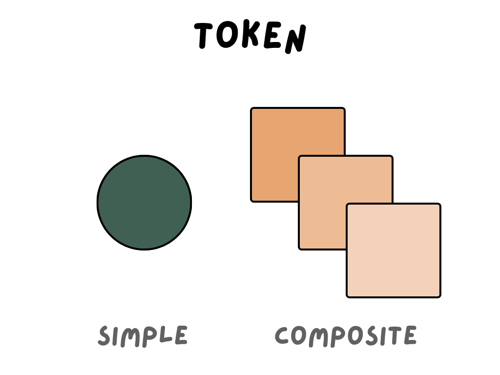
A solid shade behaves like a real design token. It can be named, reused, and applied consistently across report elements. Once you define a clear ramp of greys for different surface levels, the styling becomes much easier to manage. You are no longer asking each component to recreate a visual effect; you are simply assigning a fixed value with a clear role in the system.
The maintenance challenge
There is also a maintenance issue here that anyone who has built a large Power BI report will recognize. They include charts, cards, slicers, filters, tooltips, matrixes, containers, page backgrounds, and sometimes custom visuals or embedded scenarios. Even when the report starts simple, it usually does not stay that way for long.
From a design system perspective, it would be easier to retrieve a single hex code, rather than a two tokens. For example, a typography style might be made up of a font name, font size, line height, and color. A solid background token is much easier to scale because it removes interpretation. You are not asking people to reproduce an effect, but you are asking them to use a color with a defined purpose.
Accessibility is part of the same issue
Accessibility makes the same point from another angle. Once a color depends on what is behind it, contrast becomes harder to predict, and readability becomes harder to guarantee. A solid background shade gives you much more control over whether text, labels, and UI elements remain readable across states and surfaces.
A better rule for report design
So in Power BI, the safest rule is simple: if a background color is meant to be part of the report system, make it a real color, not a transparent approximation. Instead of using a base grey plus a transparency slider, define a proper grey ramp and use fixed values for the different surface levels you need.
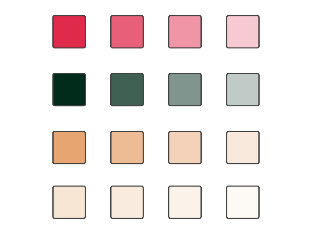
For example, rather than saying “this card uses grey with 15% transparency,” define a light grey specifically for cards, another for secondary containers, and another for subtle emphasis. That gives you something you can reuse consistently, whether you are styling a chart background, a card container, a slicer area, or another report element.
In other words, transparency in Power BI is fine when it is used deliberately as an effect, but it is a poor choice for the foundation of a visual system. It introduces ambiguity, it depends on context, and it assumes a level of formatting consistency across components that Power BI does not always provide. Solid shades are less fragile, easier to theme, easier to share, and far easier to keep consistent across a report that will evolve over time.
See you next week,
Julien